
Brand & press kit
Everything you need to show Inspire News correctly: logos, colours, type and a few simple rules.

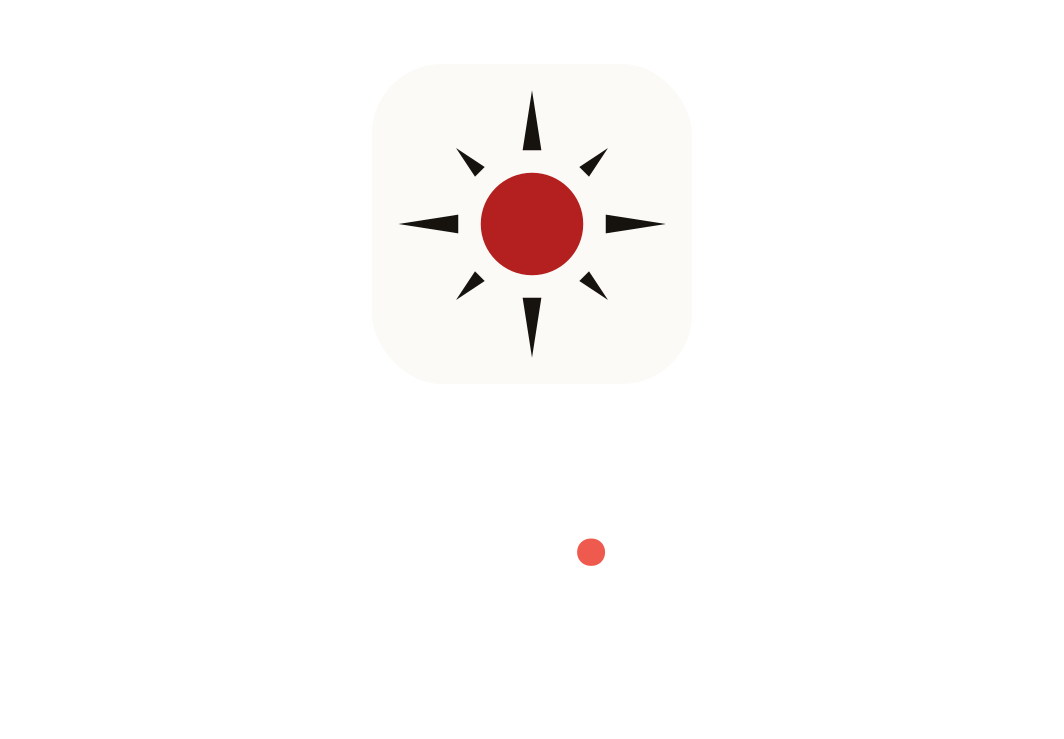
The Spark
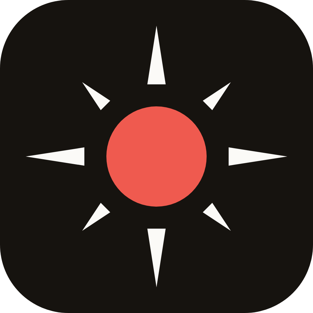
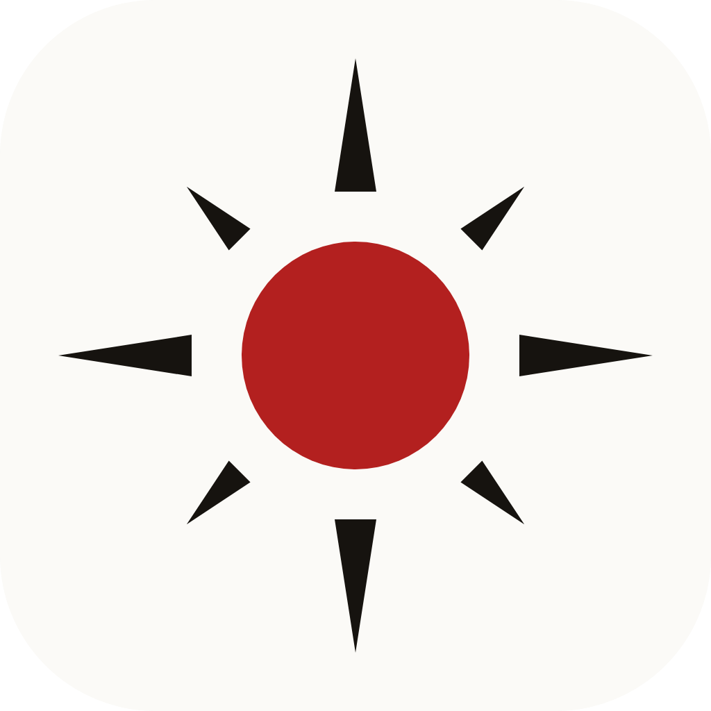
Our symbol is the red full stop from the Inspire.News wordmark, with rays bursting out of it: a story breaking, and the moment something becomes clear. The red dot is always the centre of attention. The rays are ink on light backgrounds and paper on dark ones.
Logo files
Use SVG wherever you can; it stays sharp at any size. The PNGs have transparent backgrounds.














Colour
A newspaper palette: warm ink on paper, with one red used sparingly. Red marks the brand and the most important action on a screen, never long text.
Ink
#16130FText, the app tile, dark backgroundsPaper
#FBFAF7Page background, reversed typeMasthead red
#B3201FThe dot, links and accents on lightSignal red
#EF5A4FThe dot and accents on darkInk 2
#3F3A33Secondary textRule
#E3DFD6Dividers and bordersTypography
Two families, both free from Google Fonts.
Headlines & wordmark
Newsreader
Bold (700) for headlines and the wordmark, regular and italic for standfirsts and quotes. Tight tracking (−2%) at display sizes.
Interface & labels
Inter
Regular to semibold for body text, navigation, buttons and data. Uppercase with wide tracking for small labels and the tagline.
Using the logo
Leave clear space around the logo at least as wide as the red dot. Show the horizontal logo at least 120 px wide, and the symbol at least 16 px. Below 32 px, use the favicon files; they have four bolder rays so they stay sharp.
Do
- Use the files from this page as they are.
- Put the ink-tile mark or reversed logo on photos and busy backgrounds.
- Keep the dot red: Masthead red on light, Signal red on dark.
- Credit us as “Inspire News” in running text.
Don't
- Recolour, stretch, outline or add shadows to the logo.
- Rotate the Spark or change the number of rays.
- Retype the wordmark in another font.
- Use the red for large areas or for body text.
Press enquiries
For interviews, partnerships or permission questions, contact us.